Service Design with Port Barcelona: Checking the DEVELOPMENT phase!
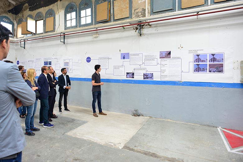
After 6 months of work, our students have finally presented the final phase
SUMMARY OF THE CHALLENGE
As part of the development plans for the Nova Bocana area, Port de Barcelona asked our students to design a new public water transport service from scratch. Following the Design Thinking process, our students carried out 3 different stages:
DISCOVERY -You can read about this stage here and here–
DEFINITION -You can read about this stage here and here–
DEVELOPMENT -You can read about this stage here and below-
All our students identified efficiency, inclusiveness, circular economy and sustainability as key points.
The process covered all the aspects of the service: building materials, fuels, stops, timing, prices, targets, guidance systems, relationship with the city’s collectives, branding, communication, and positioning.
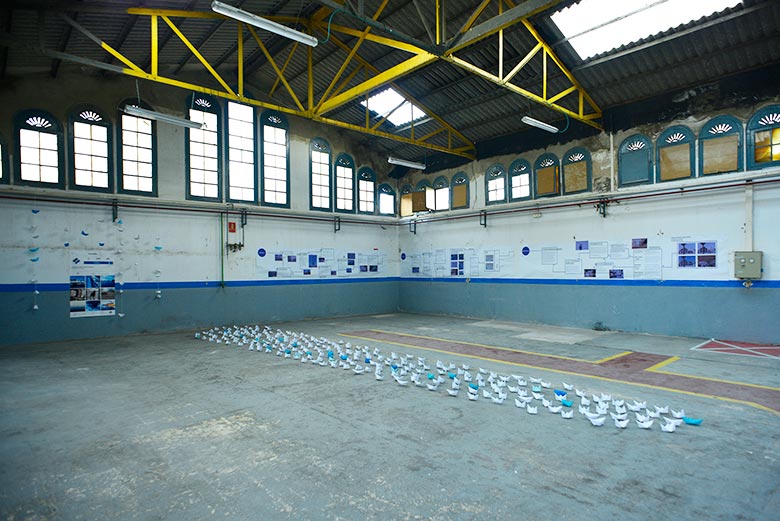
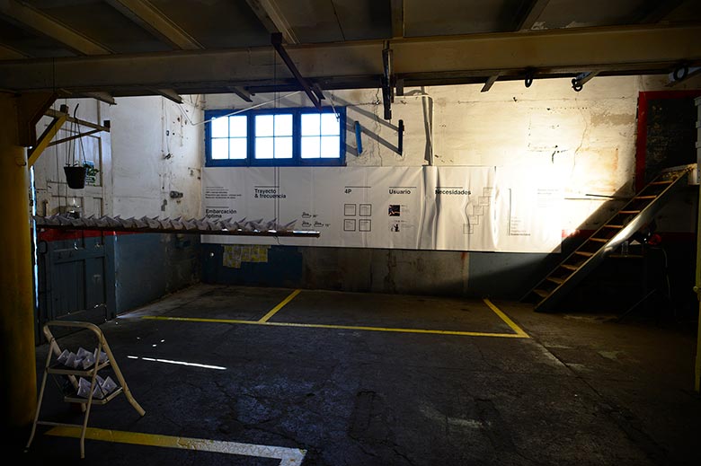
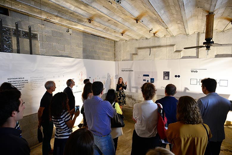
To tighten the bond between the projects and the context of the service, our students have presented their projects through ephemeral installations located inside two tinglados of the port, la Carbonera and el Tanajet (the one who will be used as station for the future service).
INFORMATION GUIDE
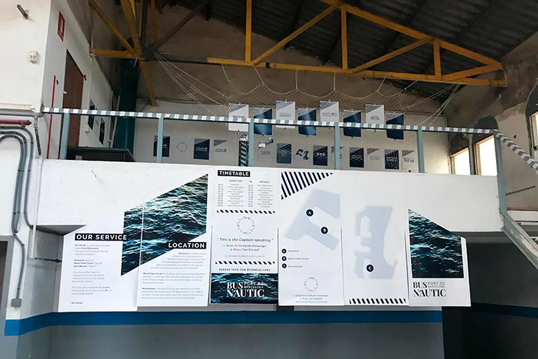

Erna Rán Jóhannsdóttir and Natalia Ruiz identified and analysed the problems in the transmission of information between the public transport services and the users and their negative impact on the functioning. In order to solve these problems, they have designed a physical and digital guidance system, called Information Guide. The system provides both visual and textual information in a clear, inclusive and effective way.
The map introduces the service and key areas to potential users, attracts people to the Port area and guide the ones who are unfamiliar with the service. It creates awareness of the service with a focus on meeting needs of both tourists and locals. The Information Guide is designed to be used both in a physical and digital way, includes a business card that can be turned out from the map and a QR scan (chat-bot) in terms of communication strategy.
The main focus when designing the Information Guide was to keep it simple, understandable and easy to use. It is inspired by the famous London tube map designed by Harry Beck in 1933. Beck’s map created new ways of identifying distance and locations and avoiding complications. Beck based the London tube map on circuit diagrams, using only dots for stops and lines for routes. Quoted to his explanation of keeping things simple he said: “Previous maps were riddled with too much information”, something he referred to as a “disease”.
They have also developed a mobile app and a fully functional website with the same information adapted to the digital environment.
TELL STORIES, SHARE IMAGES

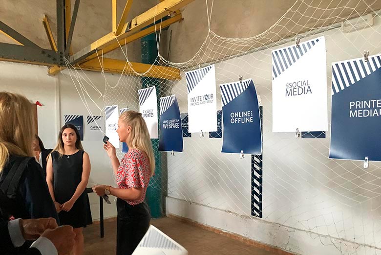
Maria Ilaria Robba has investigated the reputation of public transport among citizens. She worked on addressing the lack of closeness between the citizens and their public transport services, that can sometimes be seen even as a “necessary evil” to move around town. Her aim is to create engagement and proximity through the design of a better experience during the use of the service adding value, going beyond taking users from one point to another.
Tell stories, share pictures sets out a comprehensive communication strategy for maritime transport that includes positioning in social networks, plan of Public Relations and editorial publications that invite passengers to share their experiences through different social communication systems to create loyalty and confidence with the service.
She has designed a communication plan that embraces different social channels and takes into account the different needs and feelings that the users have in each phase of the service, from the previous curiosity until the memory after the use. The communicative actions establish a relationship that goes beyond mere utility and makes that the service is seen as a part of the life of Barcelona with a meaningful role: connecting the city and its dwellers and visitors with the sea.
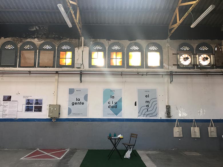
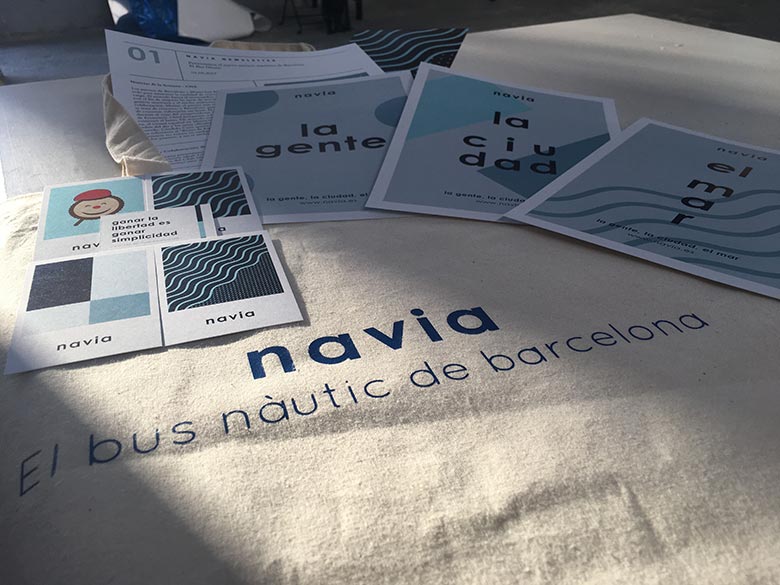
NAVIA: LA GENTE, LA CIUDAD, EL MAR
Toby Fox carried out a comprehensive Customer Experience and Human Centred Design research. He studied how each one of the aspects of the service should improve the customer experience starting far before reaching Port Drassanes and boarding the water bus, but from the moment a user decides he wants to go to Barceloneta and wants to do so with this mode of transport. Toby used as a guide the 7 factors that describe user experience according to pioneer in the UX field Peter Morville and apply them to each touchpoint along the customer journey both for all the users and to each group of users specifically to create a Customer Experience Strategy.
USEFUL. Will it help users achieve their goals?
USABLE. Is it easy to use with maximum efficiency and minimum error?
DESIRABLE. Is it satisfying to use?
FINDABLE. Can users find the service online and offline?
ACCESSIBLE. Can all people access your product or service? Is it catered to different types of users?
CREDIBLE. Does it inspire trust?
VALUABLE. What is the value of your brand?
BRANDING
NAMING. The name Navia has many roots and has been formed after inspiration from Nautical systems and terminology around the world. The first part of the word ‘nav’ and the second part of the work ‘via’. Navia has instant connotations of being a boat with the purpose to transport passengers on a certain route, in a certain direction.
LOGO. The logo synthesizes the shape drawn by the service while doing its route.
CONCEPT. In Barcelona, the local people are losing touch with their coastline, as their once humble and quiet surroundings are being overrun with tourists. The people, the city, the sea wants to reunite the local people with their precious coastline but more than that, forge a visceral connection. The people, the city, the sea is a symbol of respect, appreciation, and unity. A symbol that encompasses the true values of Barcelona. A symbol that transcends the current negative feelings to create a loyal and devoted community.
COLLABORATIONS. Navia is not just conceived as a way to physically connect the city of Barcelona to its coast, but to recover the relationship between the citizens of Barcelona with the area of the Barceloneta, which has been progressively damaged due to the impact of massive tourism. In order to accomplish that, Toby has interviewed representatives from different stakeholders of the area such as neighbourhood and cultural associations, schools, and businesses. Based on the results, he designed a plan of partnerships that would bind the progress of the service with the needs and the plans of the area where it operates and the groups and the people which make it up.
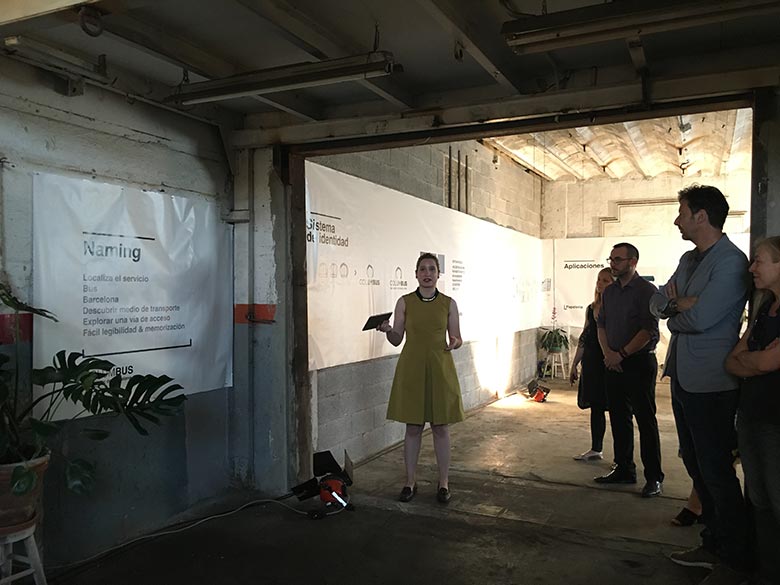
COLUMBUS
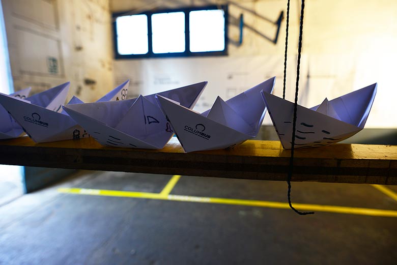
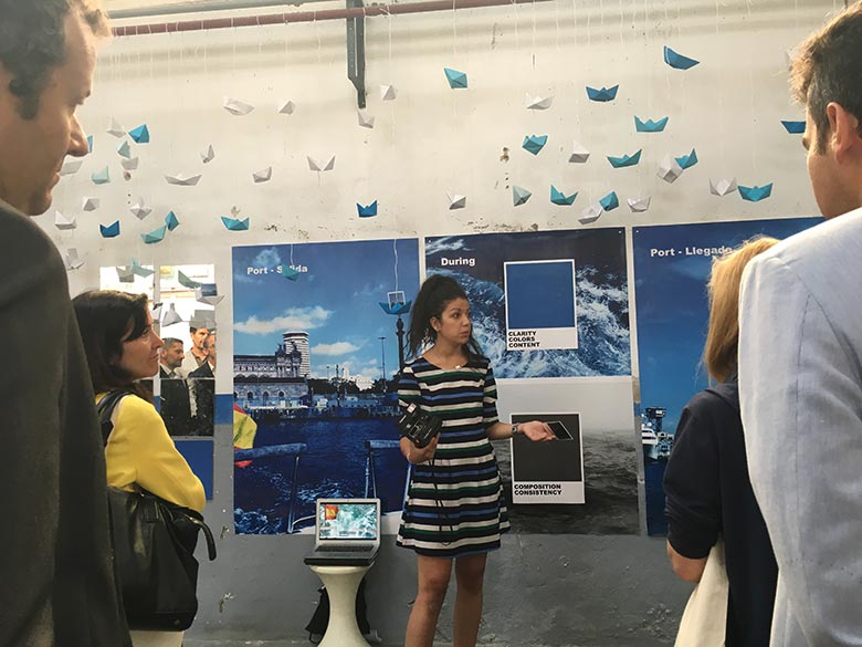
Juanita Vilamizar and Ioana Crasovan have developed a comprehensive design of the service before, during, and after the use that addresses each one of the identified points of conflict between transport services, cities, citizens and the environment.
SERVICE. Columbus is a shipping service that offers a fast route through the interior of the Port of Barcelona. It will offer a total, immersive experience that should generate curiosity and a relaxed, pleasant and safe environment. In addition, it is recommended to design the experience so that the time spent by the user in the service is not perceived as lost time. The global experience incorporates all the contacts with the different stakeholders and users can have with the service beginning with the creation of the brand and finally ending its landing and feedback. The main defining aspects of the service are:
A Generate the boat within the frame of the circular economy with natural resins that are easy to recycle or are biodegradable. The port should encourage the use of e-tickets with QR codes and, in the case of physical tickets, tokens made from disused fishing nets collected in the port itself.
B Use liquefied natural gas as main energy source supplemented by solar panels for the internal fittings of the boat. These should also be considered as design elements and not only elements of energy collection.
C Opting for these materials and renewable energies, the ship could obtain the Cradle to Cradle Certified ™ certificate that highlights its construction within the circular economy.
D Incorporate elements in its structure that allow the collection of data on the water and air quality.
E Opt for a modular structure that allows adapting to the specific demand of each moment.
F Offer multiple accesses that facilitate the user an efficient process of embarkation and disembarkation to be able to reduce the duration of the total route and to increase the frequency of the service.
G Allow access to the boat for disabled people, bicycles, strollers and light luggage.
BRANDING. As a brand, it refers to an already internationally recognized brand: Barcelona. Its texture is Mediterranean: cheerful, relaxed and full of colour. Its values are efficiency, modularity, sustainability, competition, safety, innovation, progress, and culture.
LOGO. The logo combines the initial letter of the service with the emblematic shape of the ship: a marine bubble.
NAMING. Columbus refers to Cristobal Colón and allows to easily locate the service in the city, given the proximity of one of the stops to the Columbus Monument. Additionally, it contains the word “bus” -the evidence that it is a means of transport-. Likewise, thanks to the evocation made by his naming, it encourages the discovery of a new experience.
IDENTITY. The colours chosen for the identity system have been extracted from one of the walls of the Tanajet –the tinglado that will be the future station of the services.
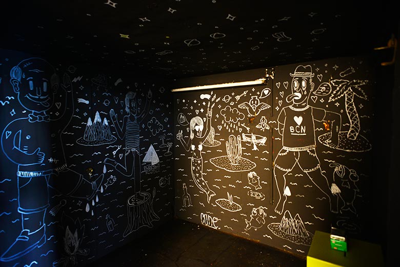
LOVE BRAND. Columbus intends to be more than a mere transport service, for that purpose, Ioana and Juanita designed an emblematic element that would turn it into a love brand. For their presentation, they painted one of the rooms of the tinglado in black and the illustrator Cane filled the room with illustrations in white. The flash of the cameras makes the illustrations become more visible than to the naked eye. The emblematic element will be continually renewed and will act as a platform for local artists.